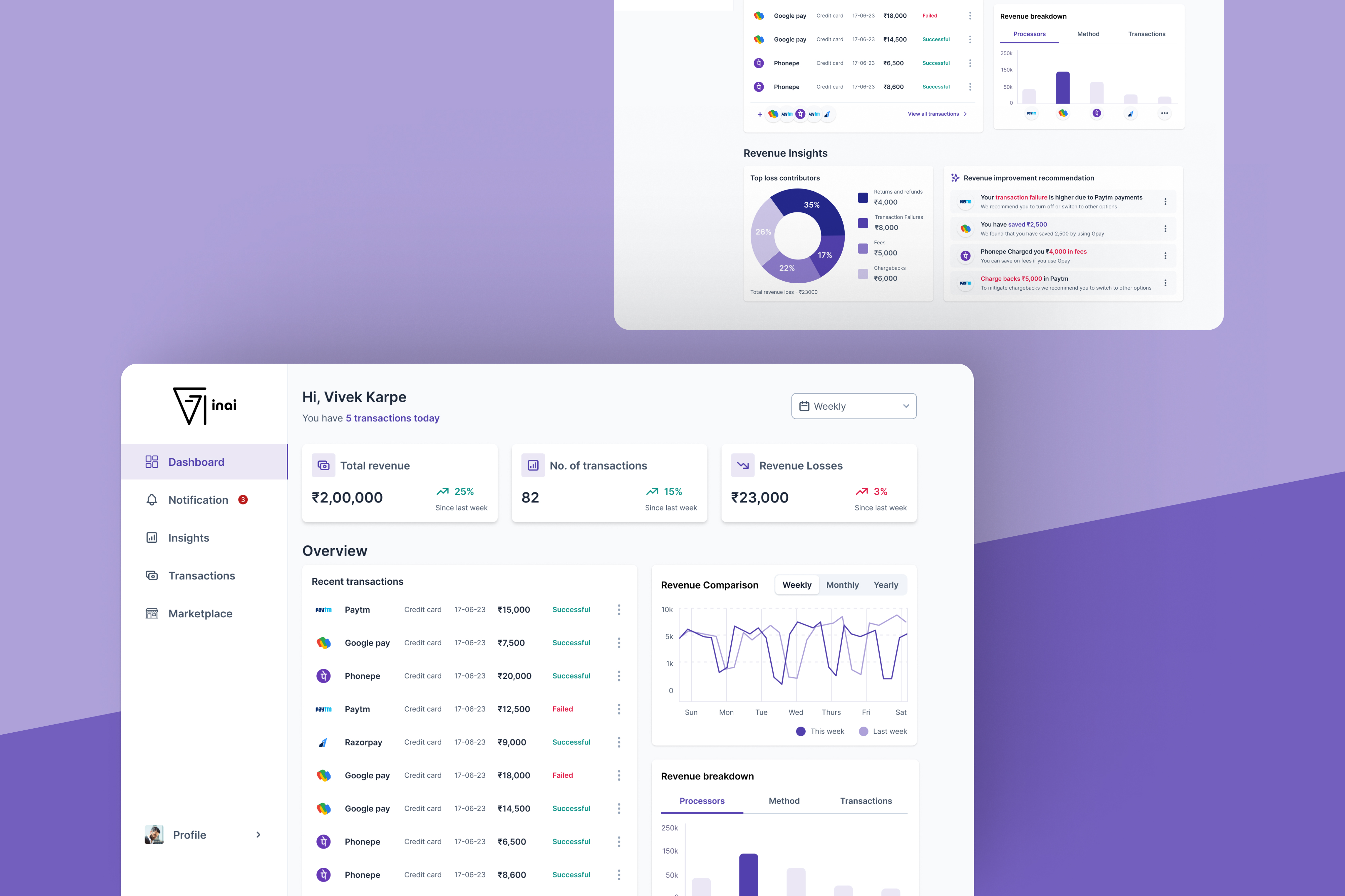
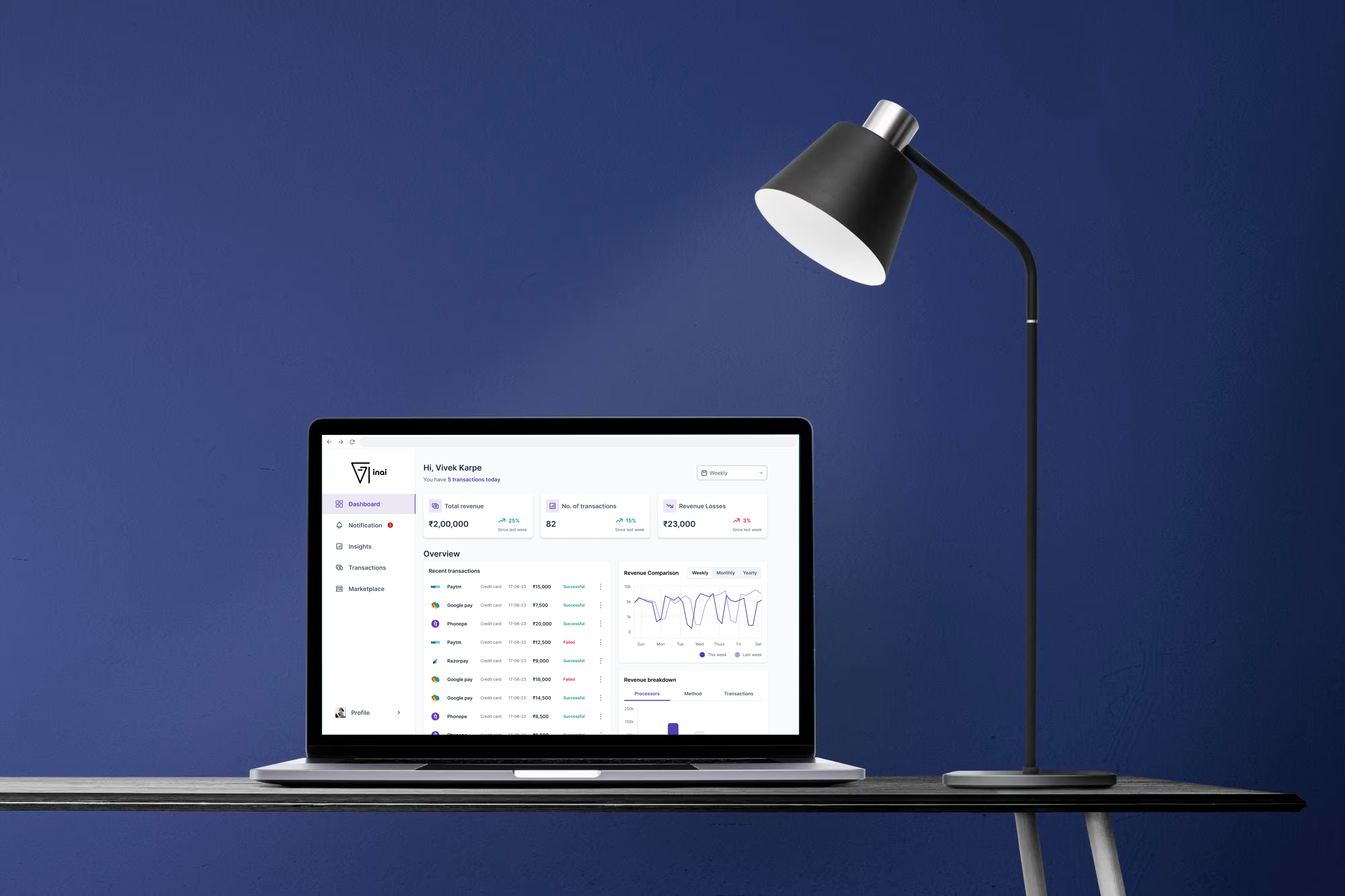
Monitor overall revenue, transactions and top-performing sources.
Payments analytics · Data visualization · Decision support
Revenue Optimization
Insights
Objective
The goal was to create a high-fidelity payments analytics dashboard that helps merchants understand where revenue is being lost, why it is happening, and where there is an opportunity to improve.
Rather than presenting a collection of charts, the dashboard was designed as a decision-making experience: understand what changed, investigate the cause, then identify an action.
Identify failures, chargebacks, fees and potential revenue leaks.
Surface recommendations that can inform revenue strategy.
01 / User story
Design around the merchant's decision.
I drafted a user story to ground the design decisions around a representative target user.
Sarah Merchant, E-Com is a small e-commerce business owner managing multiple products and most aspects of the business. She is tech-savvy, but not an expert in data analysis or payment processing.
See revenue, recent transactions and top-performing revenue sources.
Understand fluctuations caused by failures, chargebacks, fees and leaks.
Compare performance and find opportunities to improve revenue strategy.
02 / Design reference
Before designing the dashboard, I looked outside it.
I explored visual and interaction references across Mobbin, Dribbble, Behance and Google to understand how complex data could be visualized clearly.
I also looked at competitors with similar analytics capabilities to understand existing dashboard patterns and where the experience could be simplified.
↗The reference exercise was not about copying a visual language. It was about understanding patterns for hierarchy, comparison, filtering and data density.
03 / Wireframing
From separate modules to one connected view.
My first wireframe separated the dashboard into five areas: Total Revenue, Revenue Breakdown, Revenue Loss Analysis, Comparative Analysis and Revenue Improvement Recommendations.
After iterating, I grouped related information based on how the user would consume it.
Total revenue, transactions, breakdown and comparative analysis live together.
Revenue losses and top contributors are brought together as diagnostic signals.
Improvement opportunities sit close to the insights that explain why they matter.
04 / Filter exploration
The hardest question was not what to show. It was how to control time.
The dashboard needed an overall time selector, while comparative analytics also needed its own independent time selection. I explored three solutions before committing to the final interaction.
Solution 1
Use tabs for weekly, monthly and yearly views. The interaction is simple, but the UI can jump between states and there is no room for a custom date range.
Solution 2
Give each feature its own filter. This gives users flexibility, but increases the number of choices and makes it harder to remember which filters are active.
Solution 3 ✓
Let core metrics respond to their own filter while other metrics respond to theirs. Users keep control without unnecessary movement or cognitive load.
✓Solution 3 ticked all the boxes: control, clarity, no unnecessary jumping and fewer clicks.
05 / Solution 1
Explore the first filter direction.
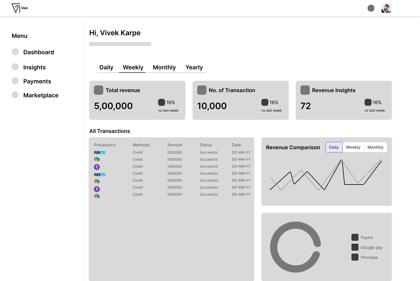
The tab-based approach makes common time periods easy to access, but it creates limitations around custom ranges and can make the interface feel like it is switching between separate states.
06 / Solution 2
More controls do not always mean more control.
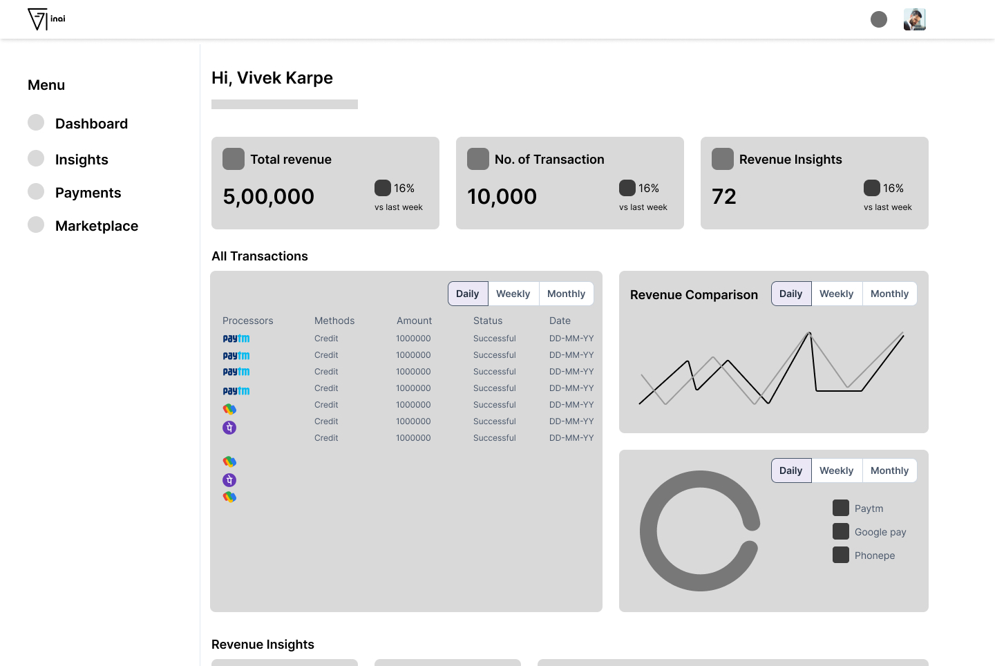
Giving every feature its own filter provides flexibility, but the growing number of choices increases cognitive load and makes the relationship between selected filters and displayed data harder to track.
07 / Solution 3
The final direction keeps the interface stable.
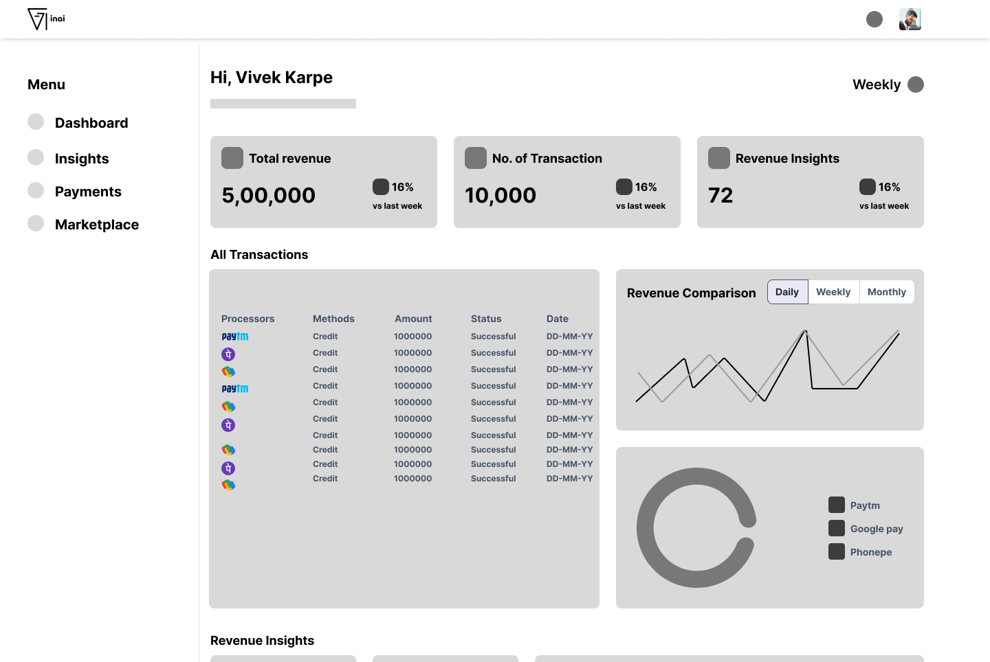
The selected approach lets core metrics change based on their own filter while other metrics retain their own context. This keeps the dashboard predictable while giving users control over the data they are exploring.
Users decide which dimension they want to change without affecting unrelated metrics.
Fewer global choices reduce the effort required to understand the current state.
The interface avoids unnecessary jumping and preserves the user's visual context.
08 / Desktop design
A desktop foundation for high-density analytics.
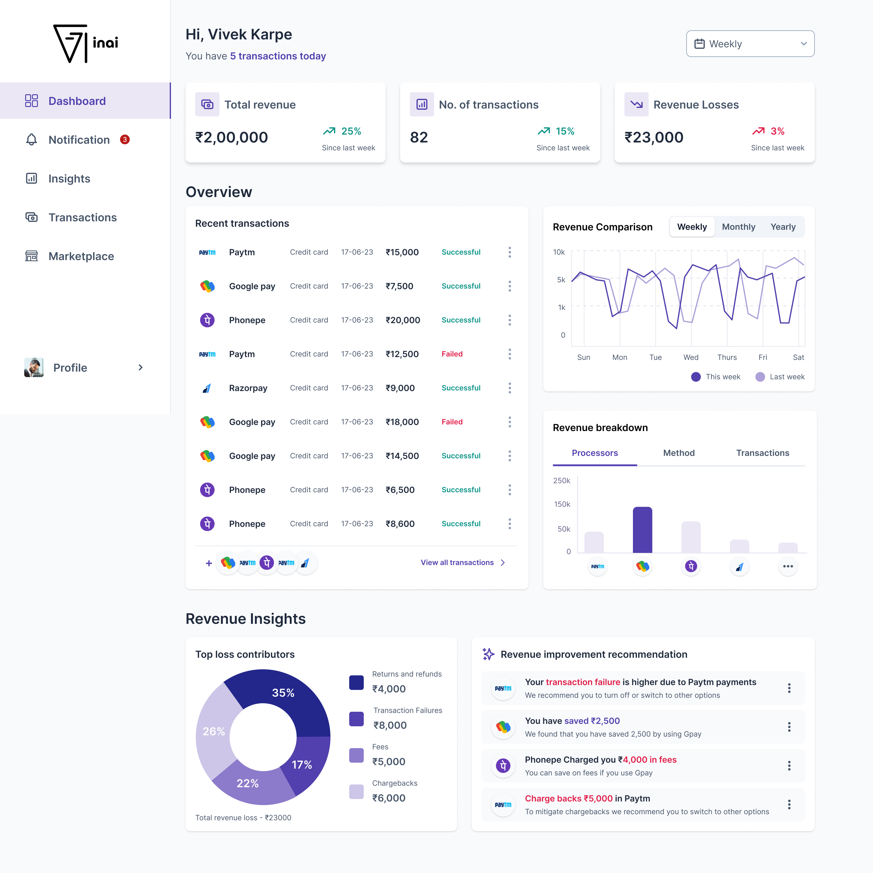
The 1440px desktop design establishes the information hierarchy, content density and filtering model before moving into the final high-fidelity screens.
09 / High fidelity
Turning the structure into a decision tool.
While designing the high-fidelity version, I changed the layout structure as the product requirements became clearer. The final direction brings the key revenue signals into a more coherent hierarchy so a merchant can move from overview to diagnosis and then to improvement.
10 / What I learned
Analytics are useful when they help someone decide.
This project changed how I think about analytics dashboards. The challenge was not simply to fit more information into one screen. It was to create relationships between metrics, filters and insights that reduce the work required from the user.
Information needs a clear order so users know where to look first.
Comparative data needs enough context to make changes meaningful.
Flexible controls should not force users to remember the entire dashboard state.
The value of an insight increases when it points toward a useful next step.