Role
Hurrey · AI-enabled IoT SaaS · Education
Making School Admissions
Easier.
Overview
Designing a product to make the school admission process easier and more efficient, with enhanced functionality and a clearer experience for school administration.
Hurrey is an AI-enabled IoT-based SaaS product company providing equal learning opportunities through an interconnected classroom network. I focused on the school administration portal, with parents as the intermediary user.
Primary user
Applications studied
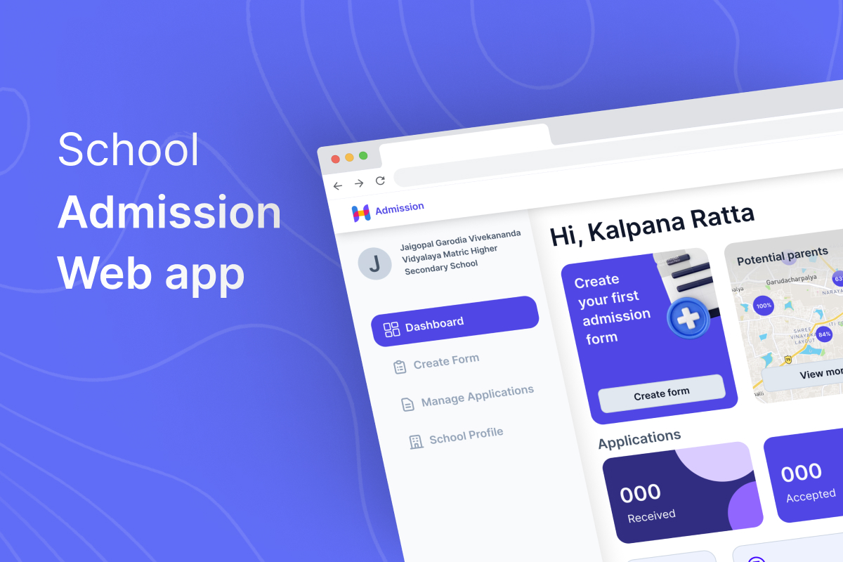
School Admissions platform
01 / Context
Admissions is a months-long operational journey.
School admissions typically last three to four months. The primary user is the school administration, while parents are the intermediary users.
My goal was to make the admission process easier and more efficient while improving functionality and user experience. I was the sole designer from start to finish.
Understood the product, scope and business case.
Understood technical limitations and aligned the final output with implementation.
Understood the data points needed and what could be surfaced to users.
Used different perspectives to challenge and improve design decisions.
Owned the product design from initial problem framing through the final experience.
02 / User journey
Start with the journey, not the interface.
I mapped the user journey to understand pain points, opportunities and emotions throughout the admission process.
- Select an employee or assign development work.
- Use the existing application form or create a new one.
- Promote the school or create an admission banner.
- Communicate with parents for enquiries.
- Receive applications from parents.
- Evaluate application forms.
- Update application status to parents.
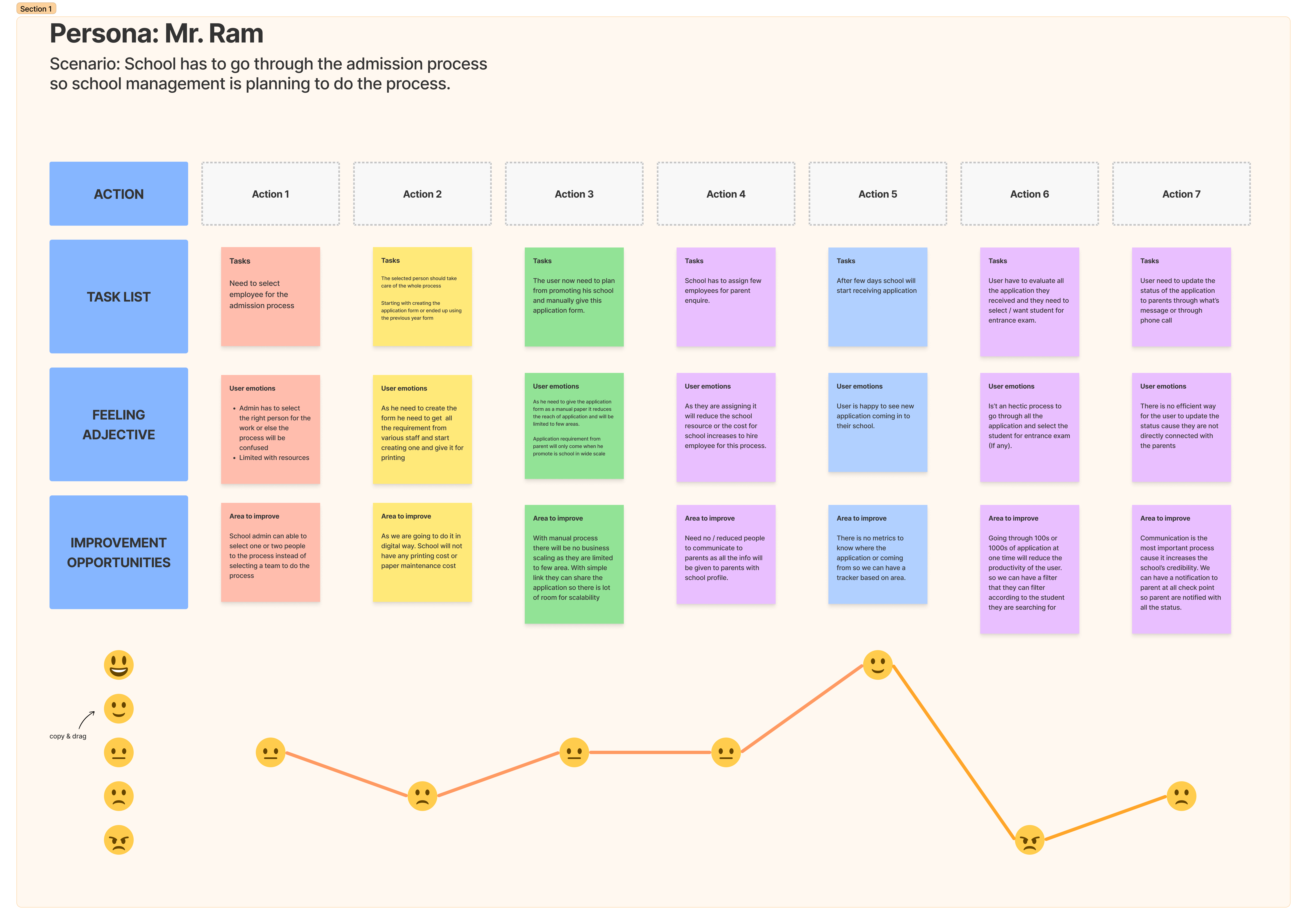
User journey
03 / Research
Understand the operational reality behind admissions.
I interviewed school staff and school principals to understand how the process actually works.
- Schools typically assign staff to handle admissions.
- Schools struggle to keep track of applications issued.
- The admission cycle typically lasts 3–4 months.
- Schools often hire advertising agencies or handle marketing themselves.
- After parents submit forms, calls increase as parents ask for updates.
- Parents look for education, discipline and etiquette, student results, sports and other activities.
→The admission queue revealed an important human and business context: schools sometimes use queues to communicate brand value.
Newly commenced schools looking to establish and scale.
Schools ready to adopt digital workflows.
Affordable Private Schools that may have good infrastructure but struggle to scale.
04 / Competitive analysis
Find the pattern, then find the opportunity.
I reviewed existing patterns across:
- Uniapply.com
- Ezyschooling.com
- Edustoke.com
- Yelloslate.com
These platforms had similar functionality and higher average monthly traffic, but they focused on a limited set of branded schools or specific areas.
05 / Product direction
Make business intelligence part of the product.
In a brainstorming session with the founder, developer and data scientist, we identified new features that could make the product stand out and provide useful business intelligence.
Helps schools estimate the number of students they can target in an area.
An approximate score based on the school's popularity in its area.
After creating an application form, schools receive a QR code to share it effortlessly.
06 / User flow
Map the flow before designing the screens.
After creating the task flow and user flow, I started approaching the problem statements and created initial wireframes to understand how each screen should work.
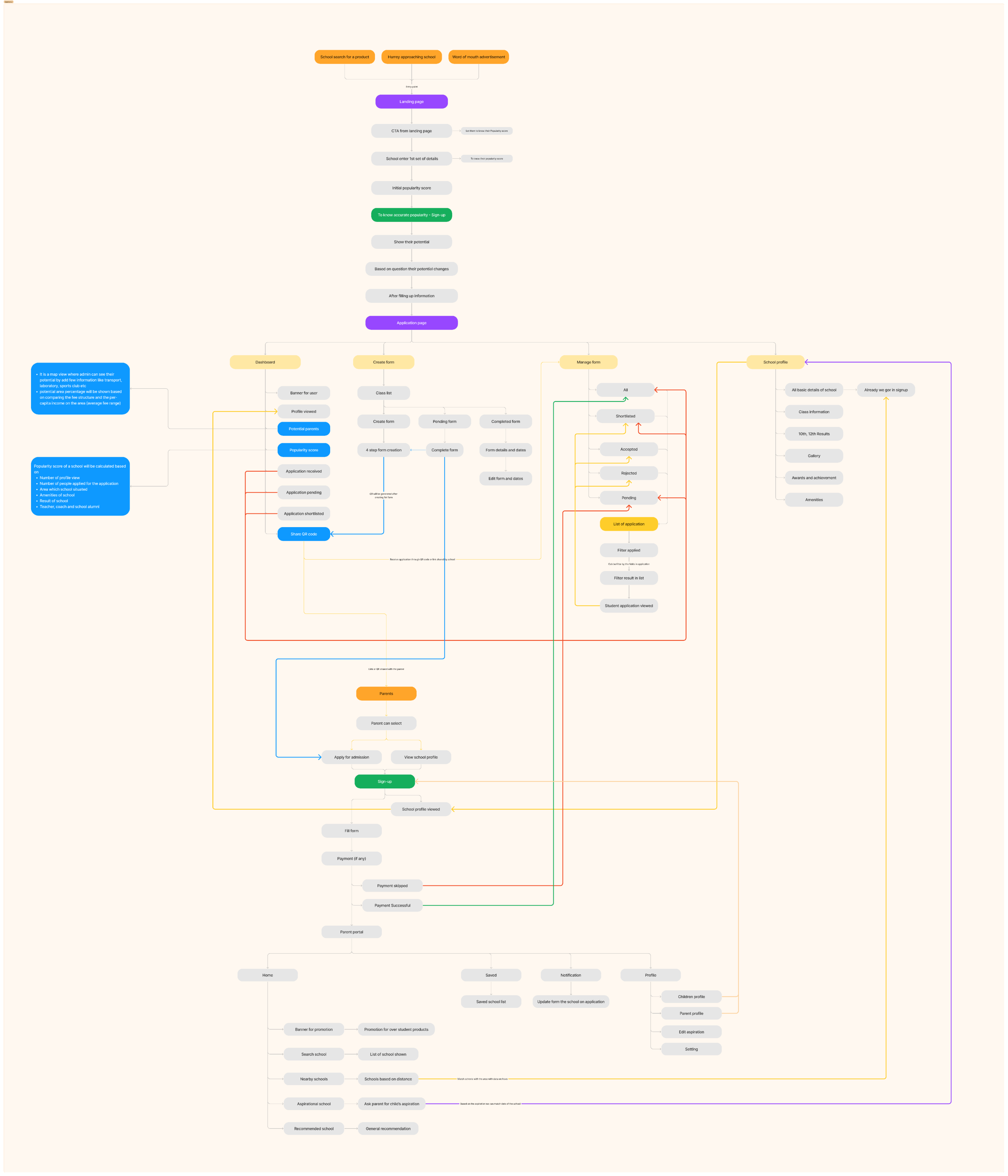
User flow
07 / Onboarding
Reduce the questions without reducing the context.
Onboarding had many questions to ask the end user, but the experience should not feel boring.
- Initially there were 10 questions.
- We reduced them to 6.
- We explored list versus step-by-step layouts.
- We chose step-by-step because the information was crucial and would reflect in the parent portal.
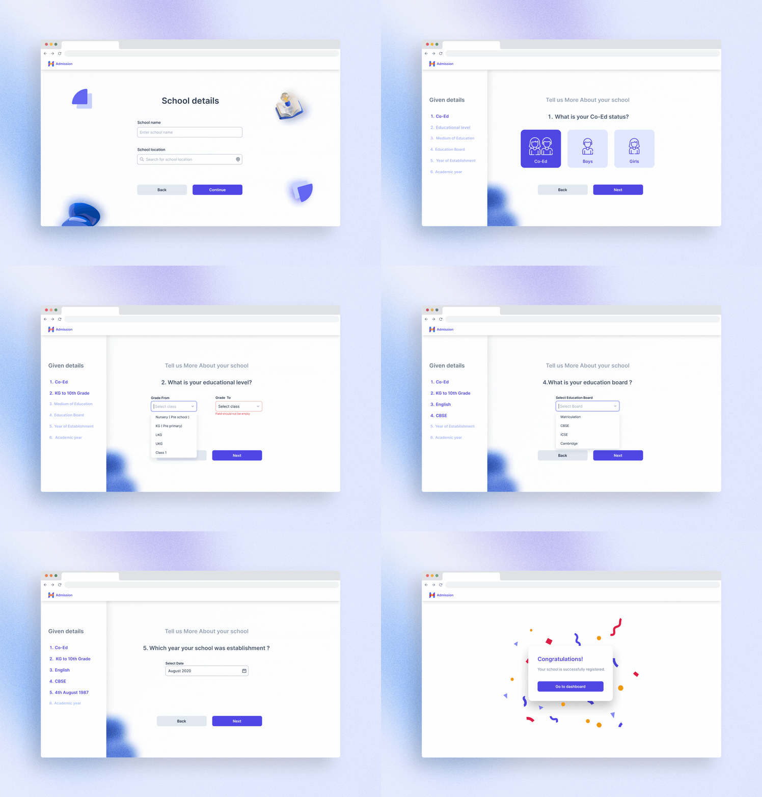
Onboarding experience
08 / Dashboard
Turn a content-heavy dashboard into an action surface.
The dashboard shows applications received, shortlisted, rejected and application-fee payments. Because this is a content-heavy page with high cognitive load, information needed the right level of emphasis.
The problem
- Difficulty tracking applications issued to parents.
- Difficulty understanding how many parents were aware of the school.
- Difficulty targeting the right parents, reducing applications sold.
The solution
- Potential Around You is accessible directly from the dashboard.
- Popularity Score is calculated from profile views and the number of views is visible.
- Schools can copy a link or QR code and share it with parents directly.
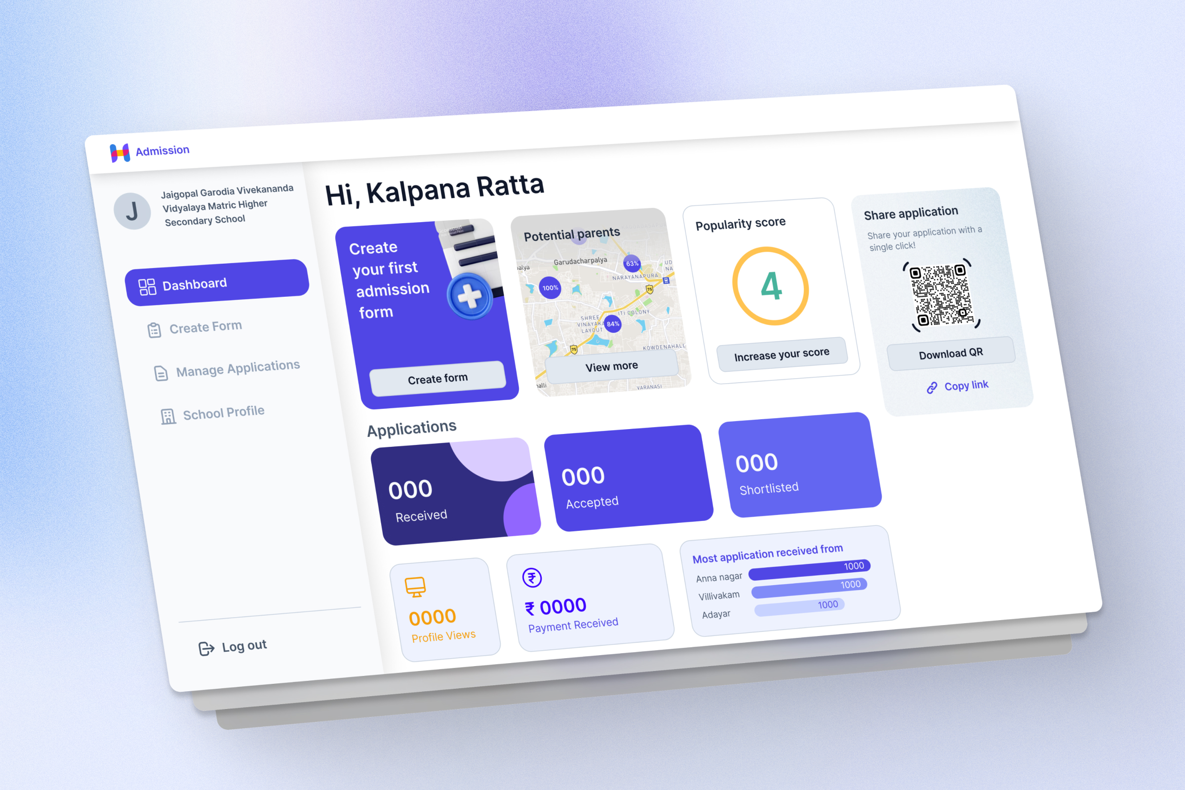
School administration dashboard
09 / Create form
Turn a lengthy paper process into a reusable form system.
Schools can create class-wise application forms with an admission fee, opening date, closing date, extended date and allocated seats.
The problem
Physical forms required discussions with administration, creation of labels and fields, government requirements, hiring a typist, printing and issuing forms only to parents visiting the school.
The solution
I researched Google Forms, Typeform and Nopaperforms, then studied 20 different schools' online and offline applications. I created pre-built fields categorized into student, parent, previous school and document details.
Select commonly required fields instead of creating everything from scratch.
Add additional fields when the school needs something specific.
Generate a link or QR code after creating the form and share it with anyone.
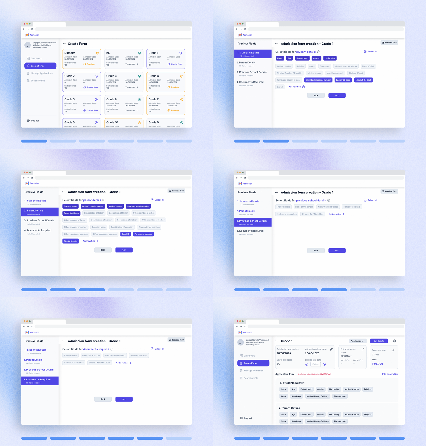
Create application form
10 / Manage applications
Make application management trackable.
Schools can manage all applications received from parents, filter applications and accept, shortlist or reject an application after viewing the student application.
The problem
- Piles of applications are difficult to maintain and communicate updates about.
- Selecting a student manually is difficult.
- The selection process takes a lot of time.
The solution
- Every application receives a unique application number.
- Viewing, accepting, shortlisting and rejecting an application digitally reflects directly in the parent portal, reducing communication issues.
- Field-based filters let users create conditions to help select the right student.
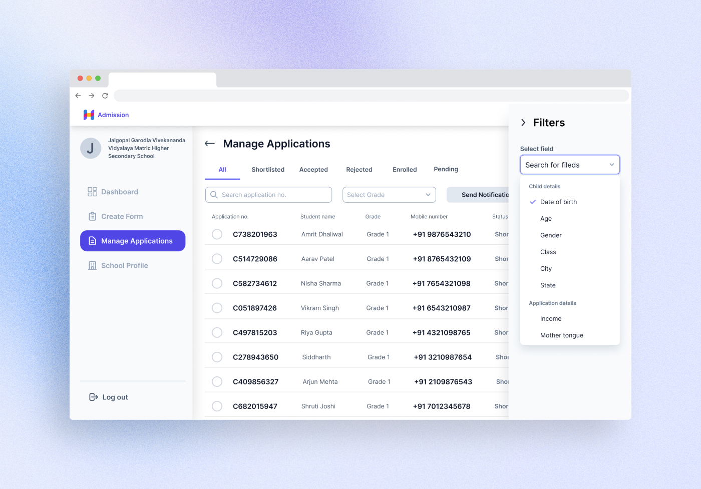
Manage applications
11 / School profile
Use the school profile to improve discovery.
I also created the school profile page. With school details, the product can suggest potential areas and calculate the correct popularity score.
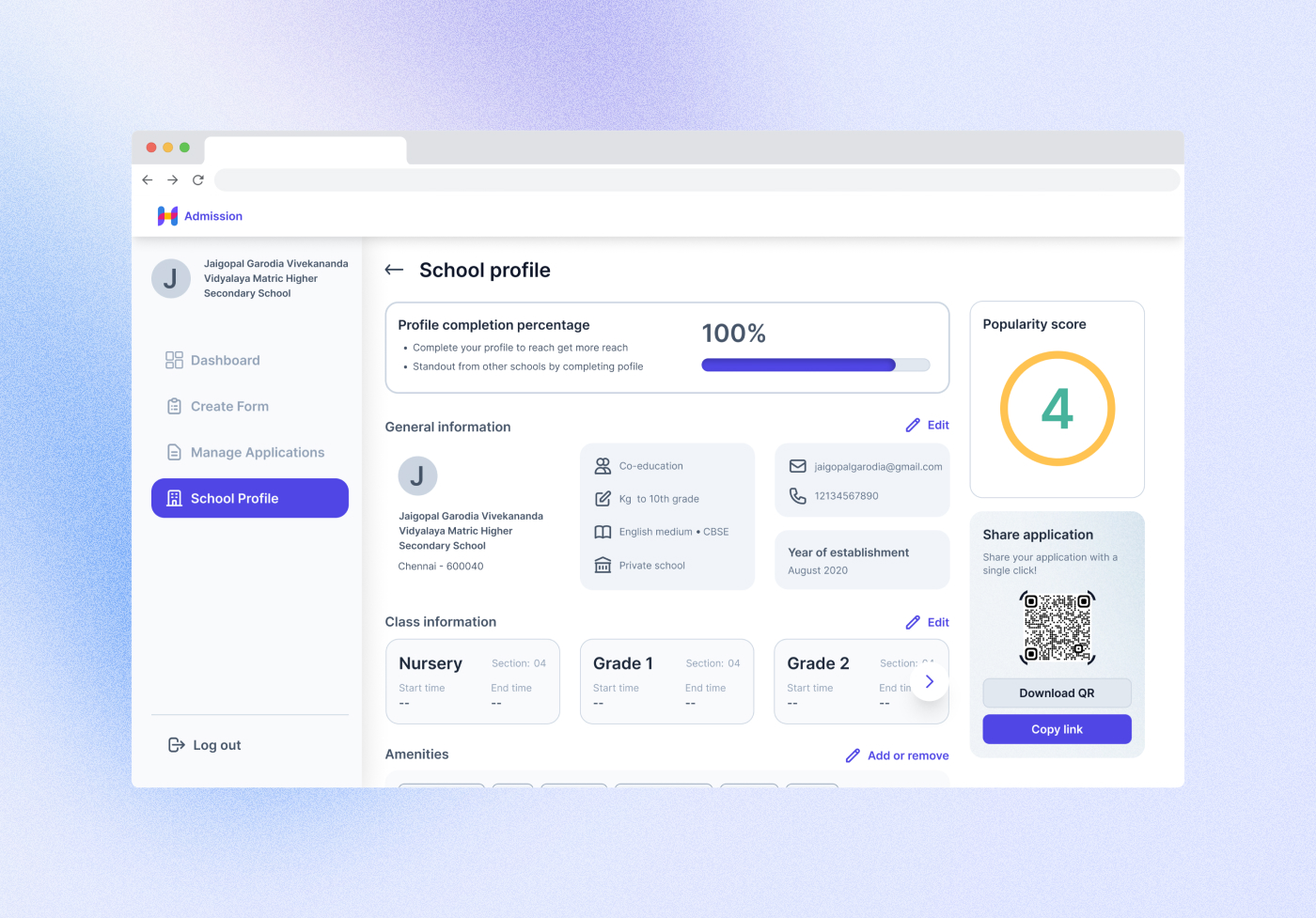
School profile
12 / What I learned
More than interface design, I learned to think in systems.
- For QR code generation, I explored Paytm, BharatPe, Starbucks and Walmart QR strategies.
- I gained technical knowledge by brainstorming and collaborating with various teams.
- More than interface design, I spent most of the time in design thinking and learned about backend processes and structuring.
- I worked with the data science team for the new features described above.
- I learned about APS, Affordable Private Schools, including how they work and their business case.