Typography styles reduced
Design systems · AI-assisted workflow · Collaboration
Building a Scalable
Typography System
Overview
Typography is the backbone of any design system. For consistency, scalability, and developer handoff, I created a token-based typography system that defines font sizes, line heights, and font weights as reusable design tokens.
How I transformed inconsistent typography into a robust, token-based design system that improved consistency, developer efficiency, and scalability across our entire product.
Design and dev consistency
Faster implementation
01 / Outcome
A typography library built to scale.
The outcome was a typography library that:
- Standardizes text styles across the product.
- Improves developer efficiency by providing ready-to-use tokens.
- Ensures scalability when adding or modifying styles in the future.
One shared language for typography across the product.
Ready-to-use tokens reduce repetitive decisions and handoff friction.
A system that can grow without introducing new inconsistencies.
02 / Starting point
How did I start?
- I audited the existing screens and typography styles across the product.
- I noticed inconsistent usage of font sizes and line heights.
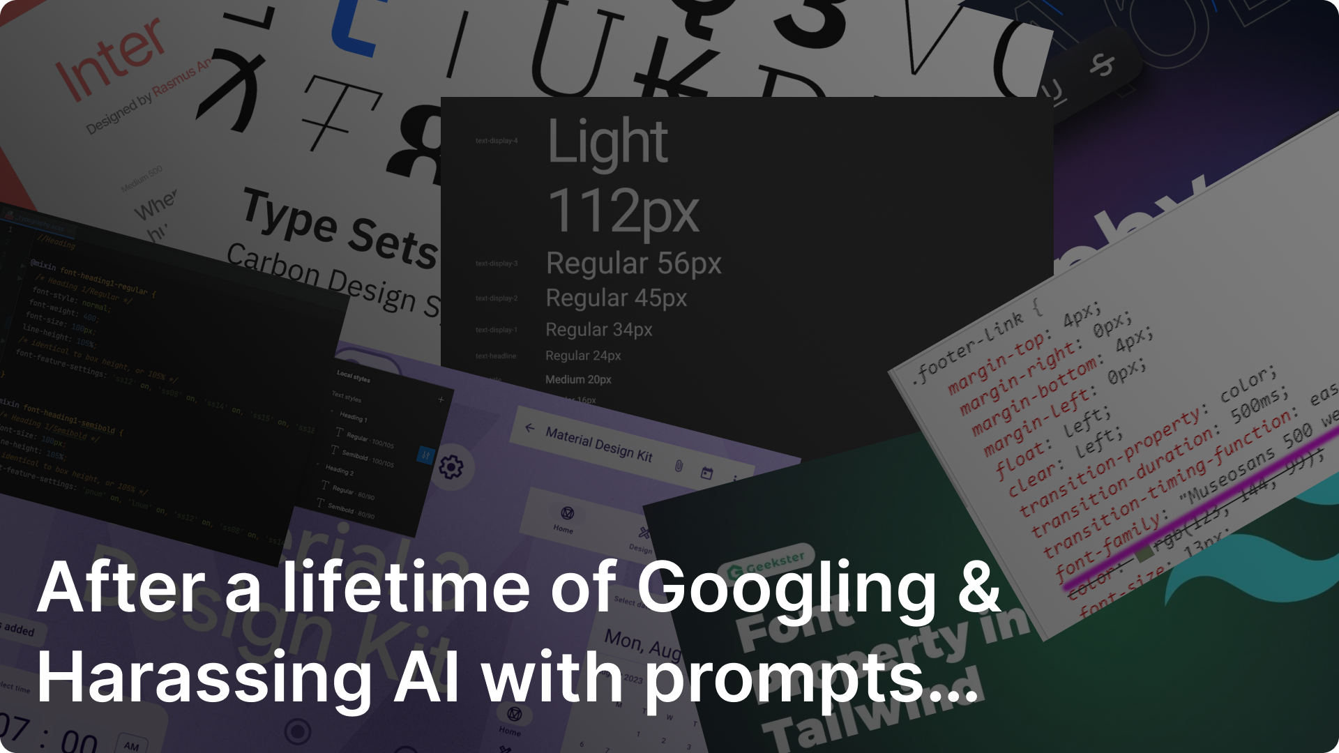
- To validate my approach, I compared with industry-leading design systems like Material Design and Tailwind.
- Then I mapped everything into a clean, minimal scale.
👉🏼Typography inconsistencies cause confusion for both designers and developers. Creating tokens reduces duplication and enforces consistency across the product.
03 / References
Framework Inspirations
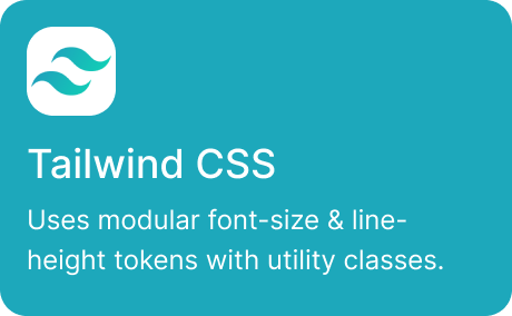
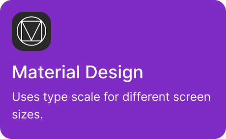
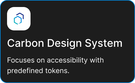
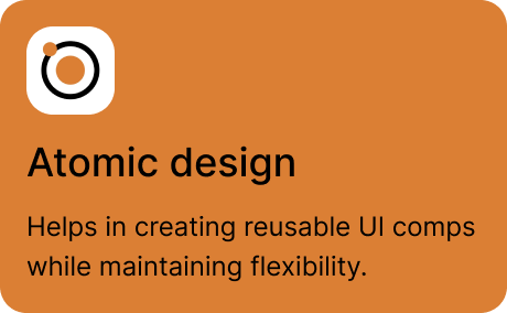
How our product can stand out
- By keeping the token system minimal yet scalable.
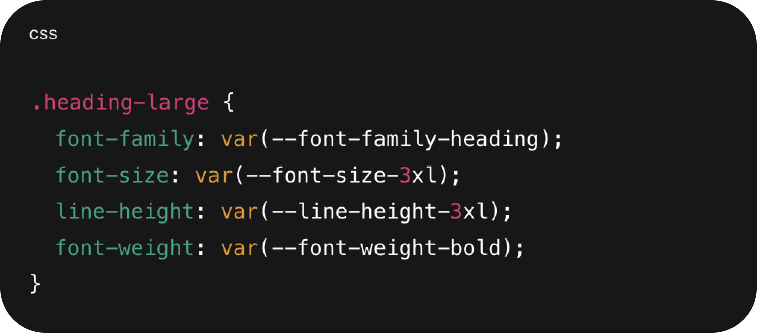
- By making it developer-first (CSS custom properties).
- By providing a clear mapping between design (Figma) and code.
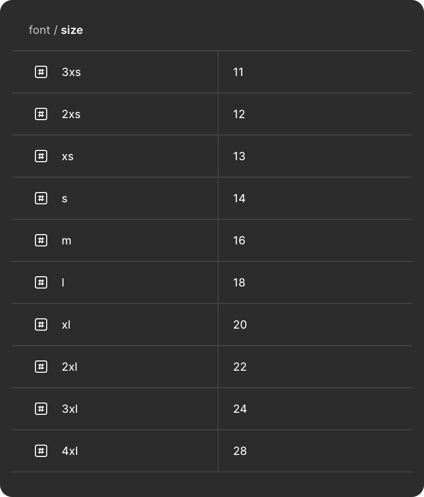
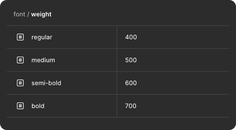
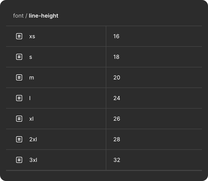
04 / Figma
Figma variable setup
05 / CSS
Global CSS setup
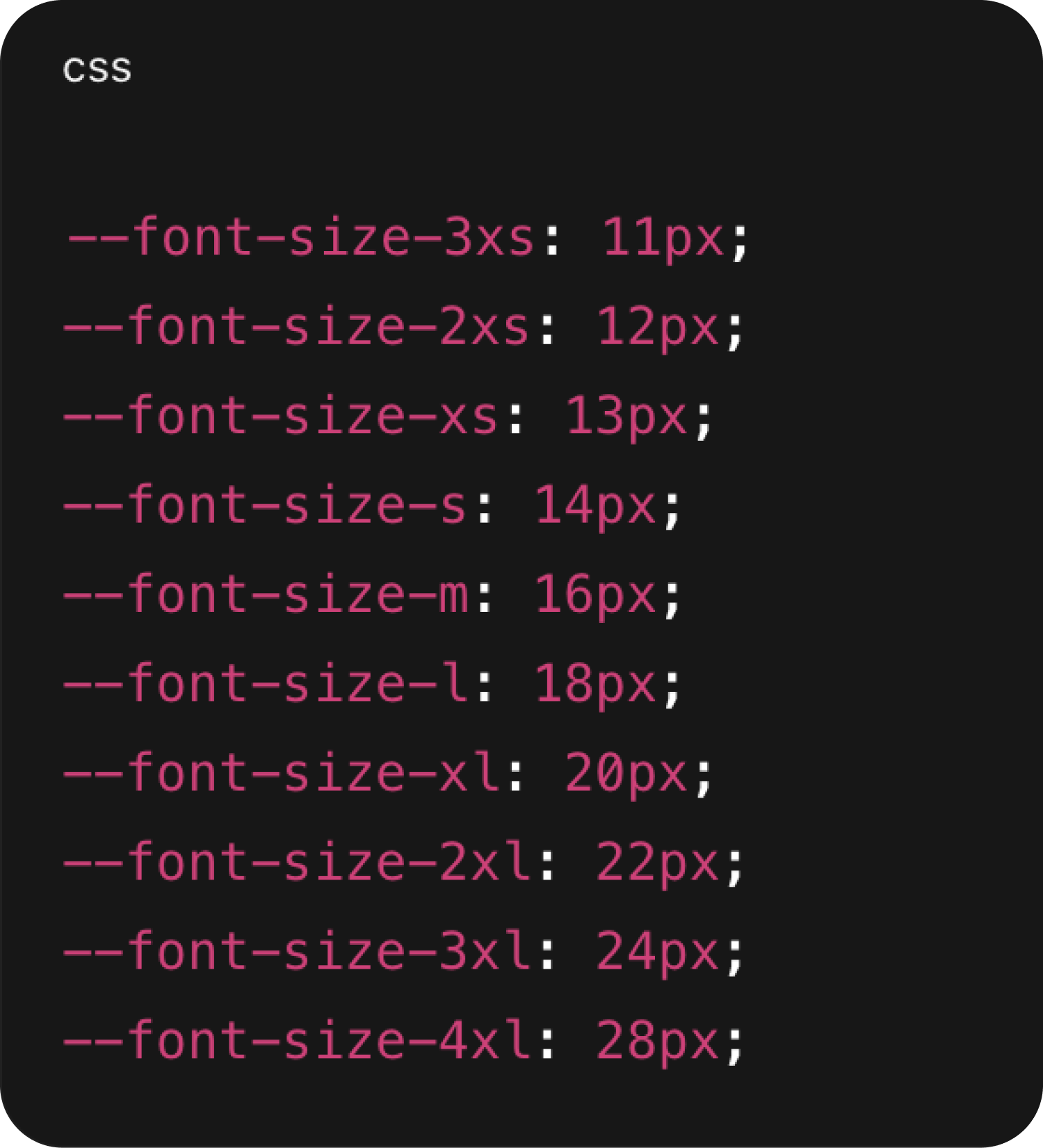
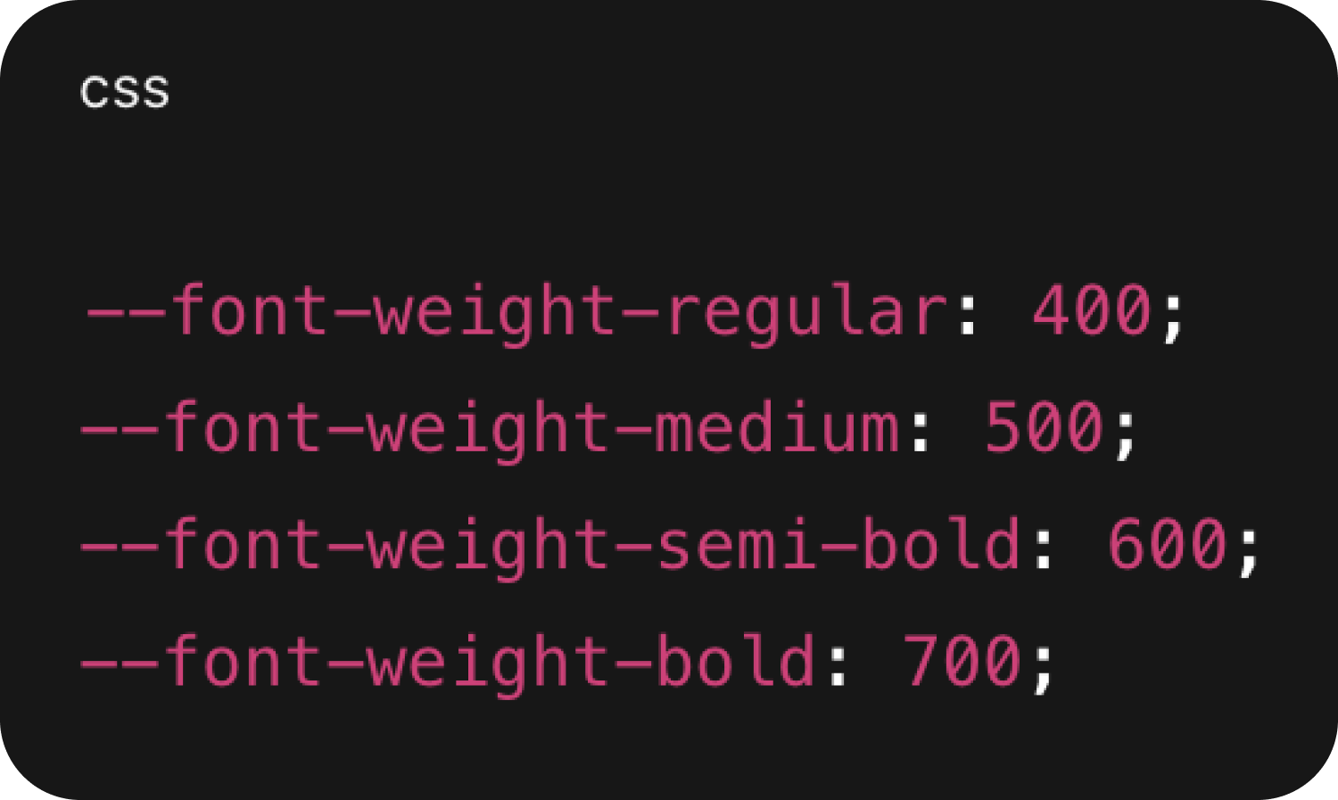
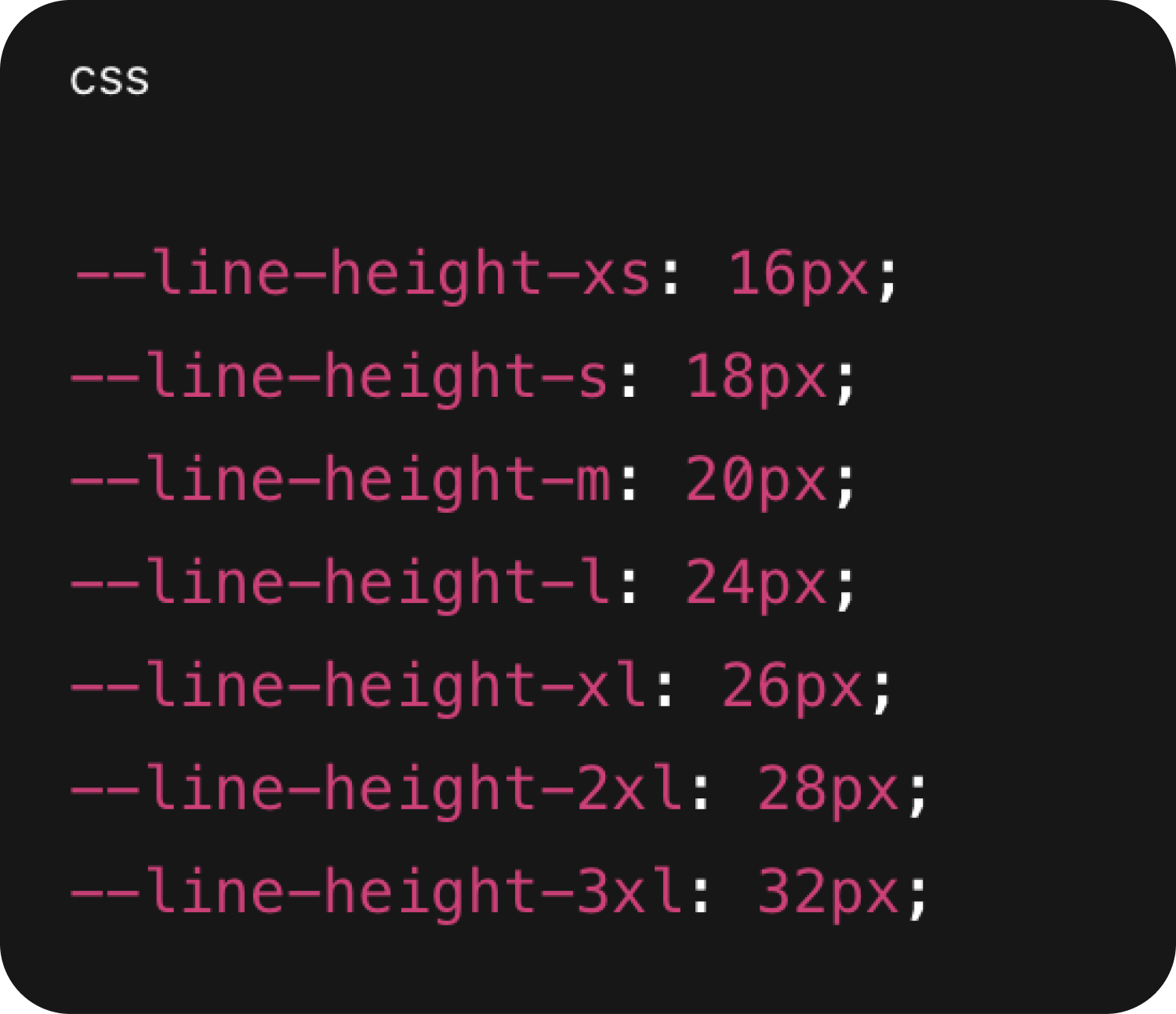
⚠️For this version, I have considered only one frame size(1920px). In the future, I plan to extend scalability for multiple breakpoints (responsive typography) so the system adapts across devices.
06 / Implementation
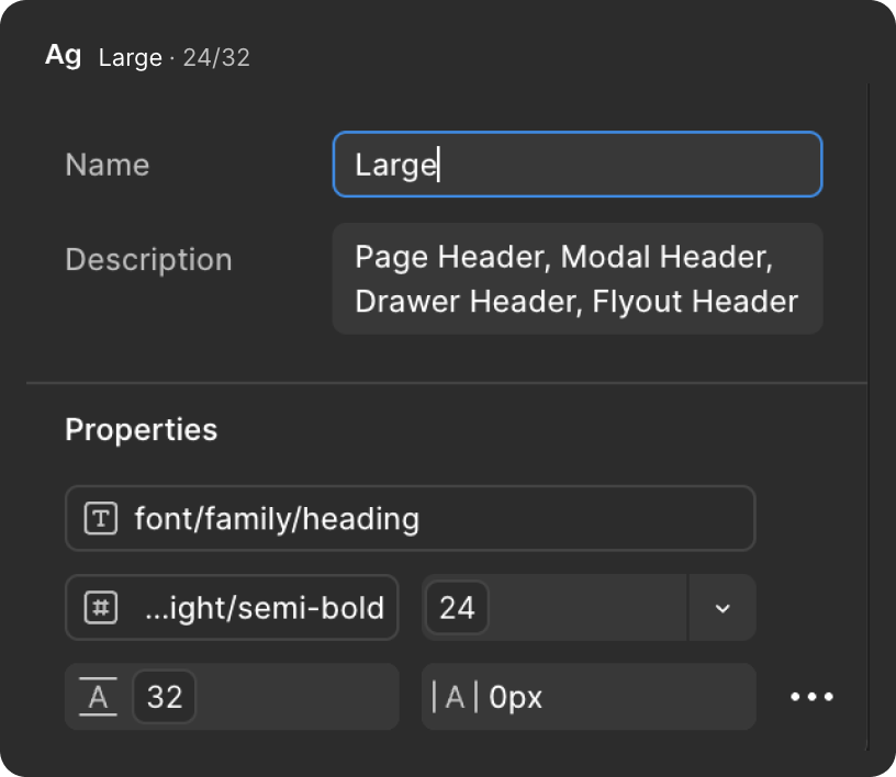
Once the library has been created. Time to create the styles in Figma and class in CSS.
Example
07 / Impact & Results
Impact & Results
The typography system created measurable improvements across design consistency, developer productivity, scalability, and accessibility.
Designer and developer work with the same values.
Reduce design and development sync issues.
Adding a new size or weight is easy.
Line height helps ensure readability across the platform.
08 / Learnings
What I have learned from this project
- Learned how small inconsistencies in typography create big problems for product teams.
- Understood the importance of tokens as a bridge between design and code.
- Learned that keeping the system minimal and flexible is more effective than having too many styles.
- Improved my knowledge of accessibility and readability by pairing font sizes with appropriate line-heights.
09 / How I worked
AI, design and engineering.
I used AI as a force multiplier throughout the project, while keeping the design decisions, validation and implementation alignment grounded in the needs of the product and team.
AI-assisted exploration
Claude + Figma Agent
Used AI to accelerate exploration, structure ideas, validate approaches and reduce repetitive work while I owned the design direction.
Design ↔ Engineering
Consistent collaboration
Worked closely with developers to make sure Figma variables translated cleanly into CSS custom properties and production-ready patterns.
System thinking
Built for the team
Focused on a smaller, reusable system that designers and developers could understand, adopt and scale together.