Role
Hurrey · AI-enabled IoT SaaS · Education
Redesigning the Teacher
Experience
Overview
A ground-up redesign of the teacher application to make everyday classroom workflows easier to navigate, understand and act on.
Hurrey is an AI-enabled IoT-based SaaS product company providing equal learning opportunities through an interconnected classroom network. My focus was on totally redesigning the teacher experience, improving functionality and user experience.
Focus
Accessibility standard
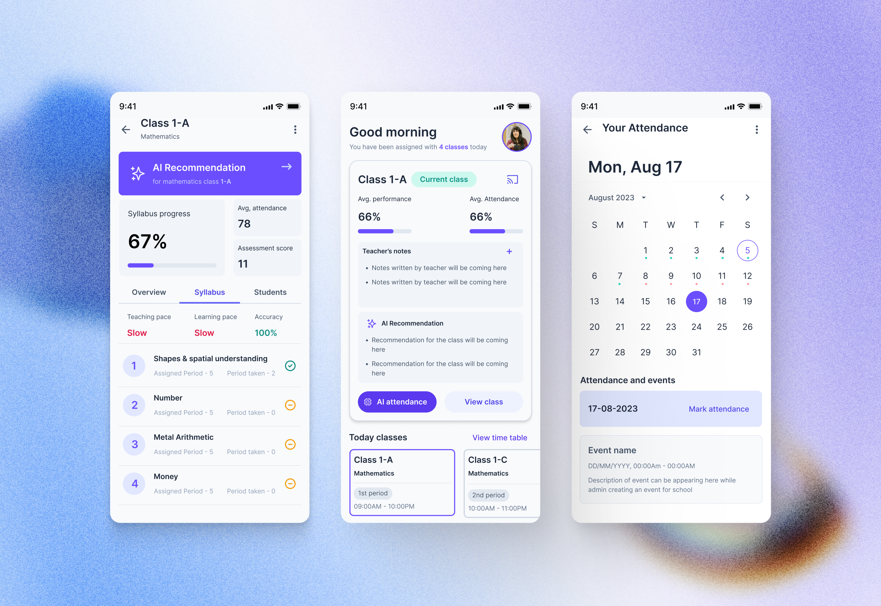
01 / About Hurrey
One interconnected classroom network, with the teacher at the center.
Hurrey has Admin, Teacher and Student logins. This case study focuses on the teacher experience.
I was the sole designer from start to finish, collaborating with others throughout the project.
Worked together for timely feedback and design direction.
Worked closely to ensure the final output matched the design accurately.
The teacher product was one of the first experiences to adopt the new design system.
02 / Starting point
The old experience created friction in simple flows.
Teachers struggled to use the application at one go. Even simple flows created doubts and confusion.
The existing experience also had opportunities for improvement in information architecture and functionality.
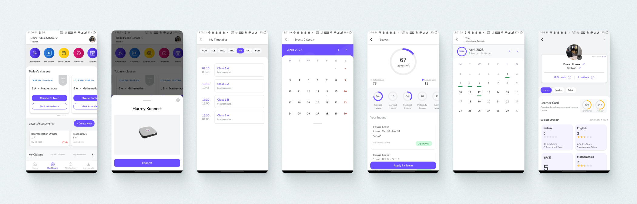
Older version · Teachers application
03 / Application tour
Use onboarding to teach the product.
I explored an application tour during onboarding. Onboarding is the one flow where a user is expected to move through a linear path, making it the right moment to introduce the application.
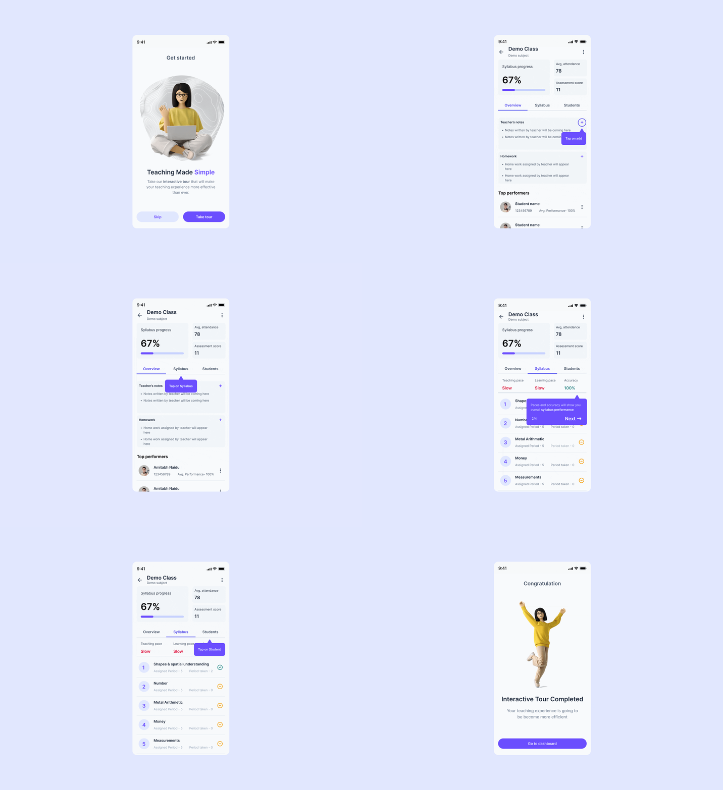
→The goal was to reduce the learning curve, not add another layer of UI.
04 / Teacher's dashboard
Make the current class the starting point for decisions.
Hurrey was adding more AI features, including recommendations based on prerequisites and performance at class and student level, AI attendance and other intelligent classroom capabilities.
The product needed to communicate its AI SaaS positioning without affecting usability.
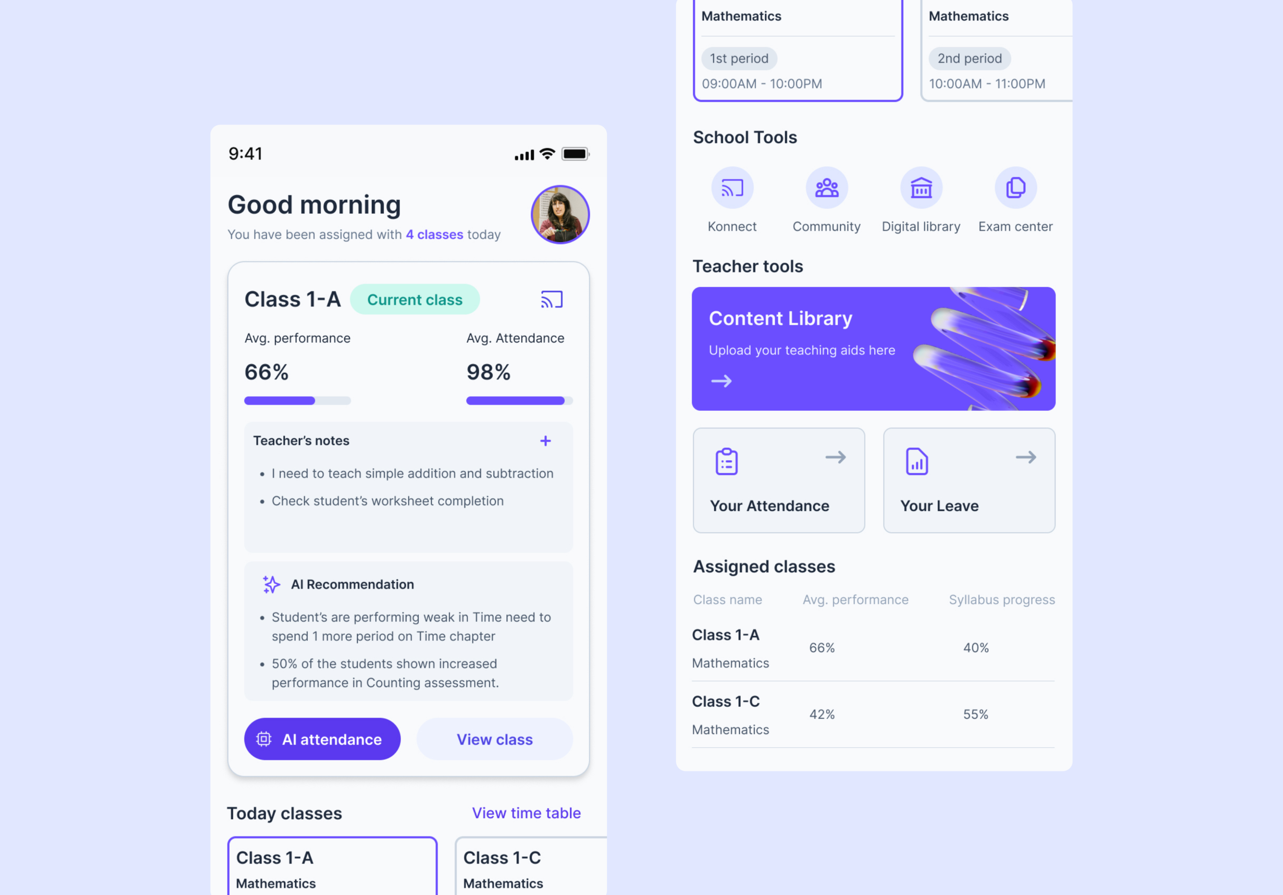
New version · Teacher's dashboard
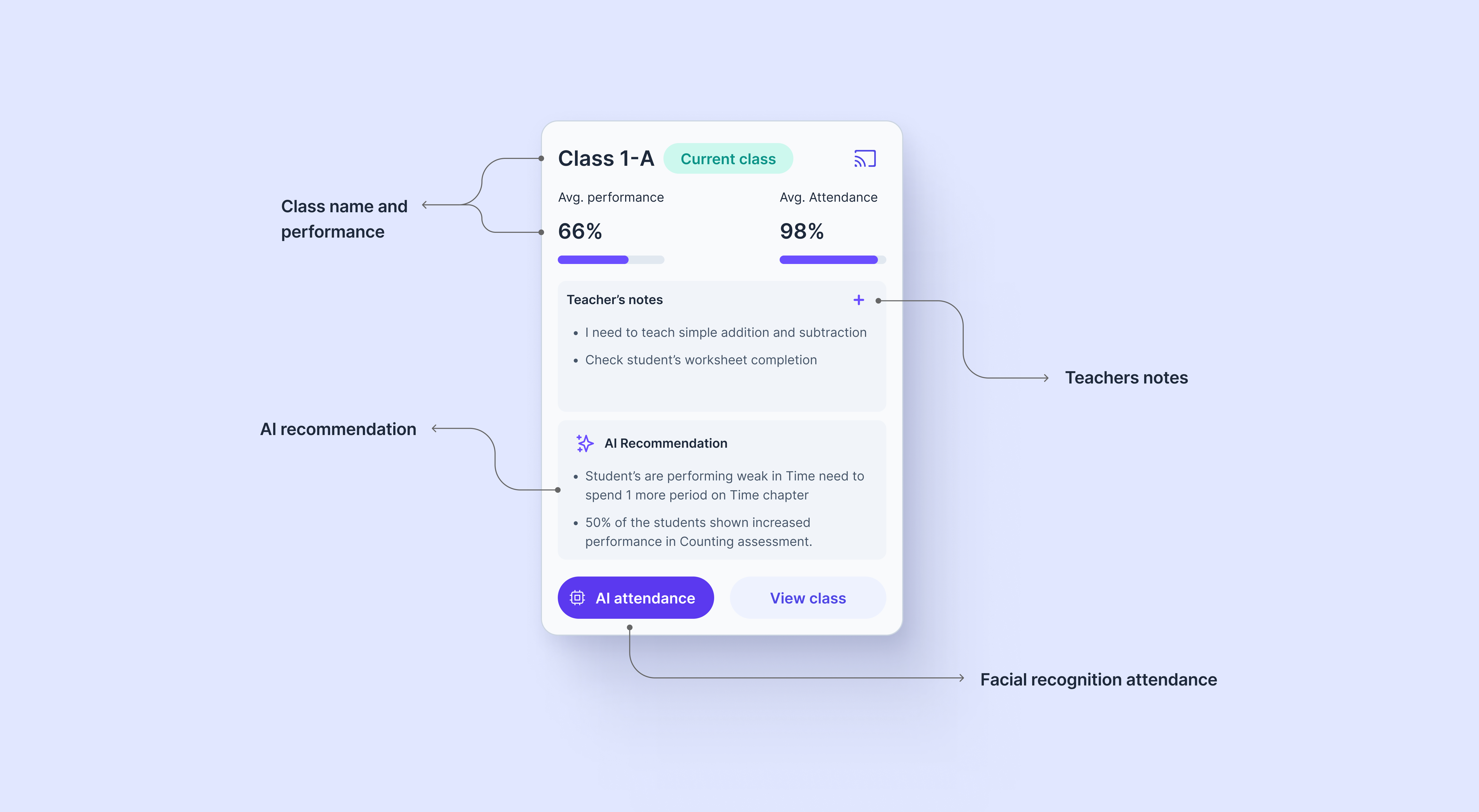
The dashboard dynamically reflects the teacher's current class based on assigned classes and time or period. I emphasized AI recommendations and surfaced tools that help teachers teach, manage and maintain the class.
Each card needed to be valuable and informative, helping teachers make decisions at a glance. Metrics show syllabus progress and performance from assessments, exams and concept understanding, including percentage increase or decrease.
AI recommendations were brought out of the class view so they could be seen earlier. AI attendance using facial recognition was also surfaced at both class and student level.
Compared with the previous design, dashboard engagement increased because teachers could view and edit more details directly.
05 / Hurrey Konnect
Give a connected classroom product the space to explain itself.
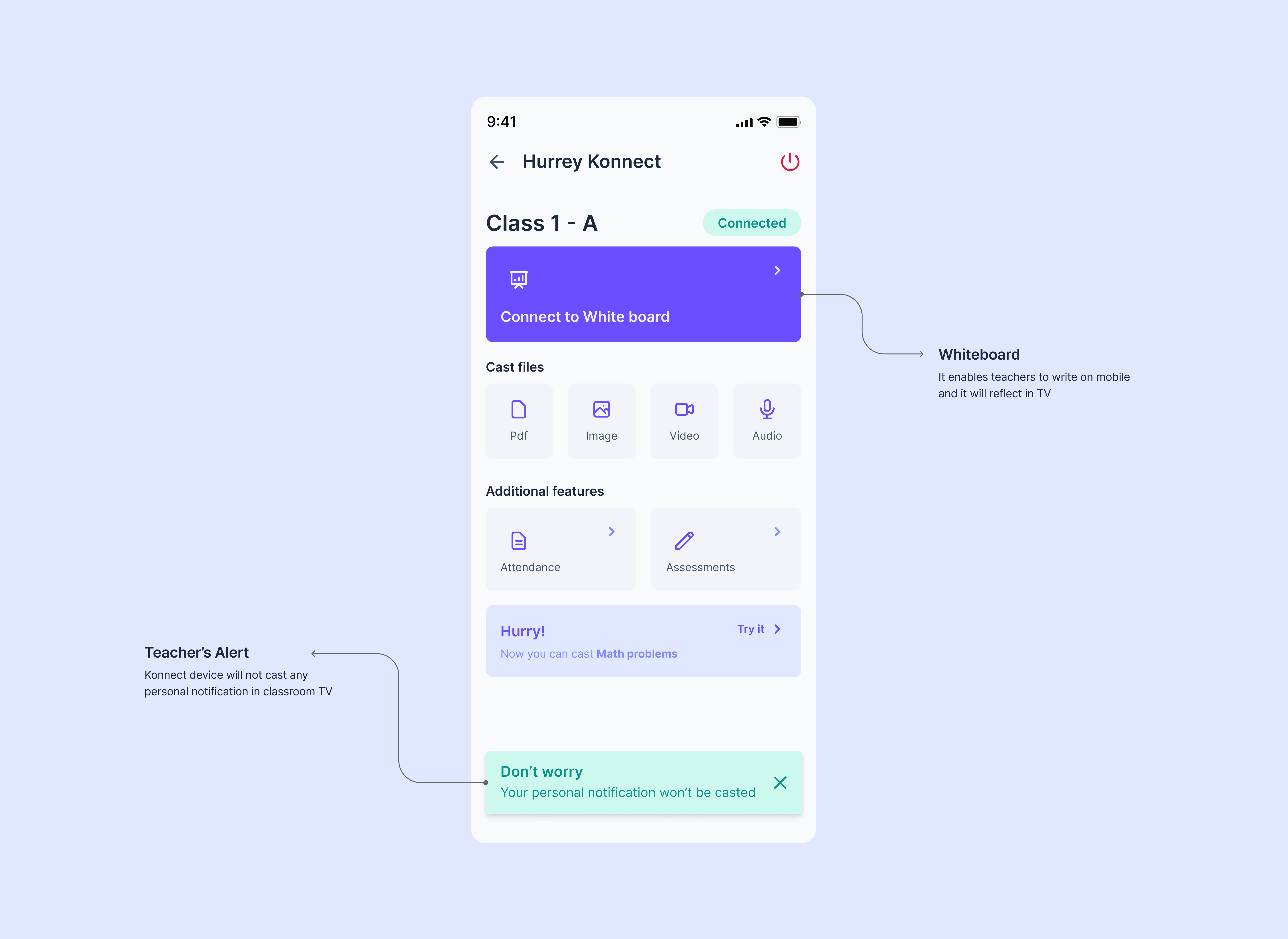
Hurrey Konnect turns a normal TV into a Smart Class TV. Teachers can cast learning aids while the device connects to the app.
The old Konnect experience used a floating menu that hid features. A dedicated screen made the product's potential and features visible.
New version · Hurrey Konnect
The redesign made device connection status visible, allowed the whiteboard to mirror mobile to TV, clarified supported file formats and introduced class or subject-specific features. For example, a math solver could be shown specifically to a math teacher.
Separating the dashboard and Konnect also created a clearer product model and improved teaching efficiency.
06 / Class view
The most complex screen needed the clearest information architecture.
The class view was the most cluttered area of the application. Teacher testing showed that users struggled to navigate it, so I gathered information from teachers in different schools.

Old version · Class view
The old experience created confusion between Syllabus and Insights even though they contained similar information. Teachers had to move through multiple steps to understand the class, switch between syllabus and insights and inspect students.
The interface was cluttered and lacked information architecture.
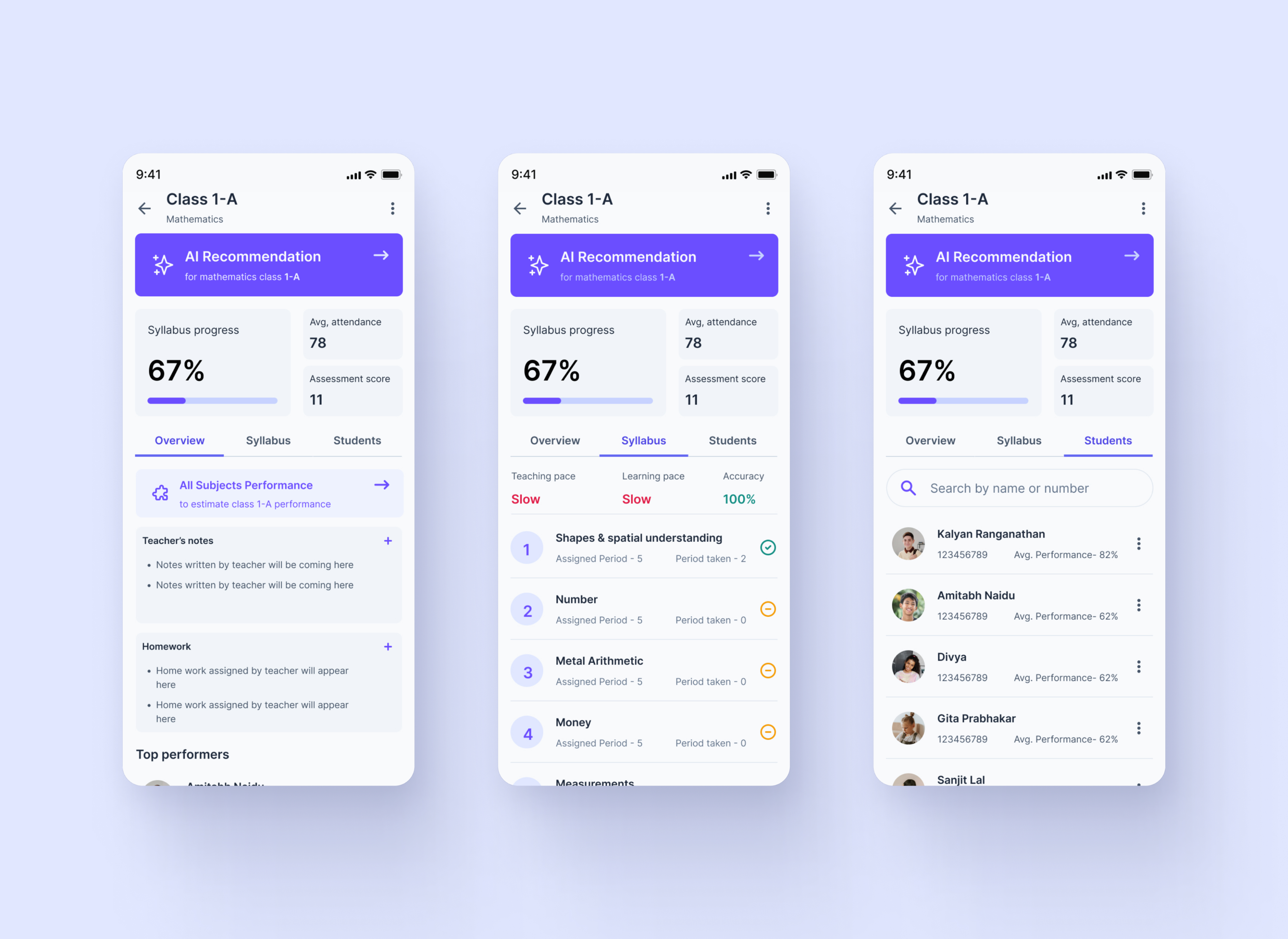
New version · Class view
I iterated through different layouts and selected the final structure based on clarity and usability. Class performance was brought into view at a glance, reducing the number of steps needed to understand what was happening.
AI recommendations at topic-level performance helped teachers make decisions. Teacher notes and homework could be added directly, with the potential for notes to evolve into a lesson planner.
Cross-subject performance broke the silo between subjects and showed the broader class standard.
07 / Syllabus
Turn performance data into something a teacher can act on.
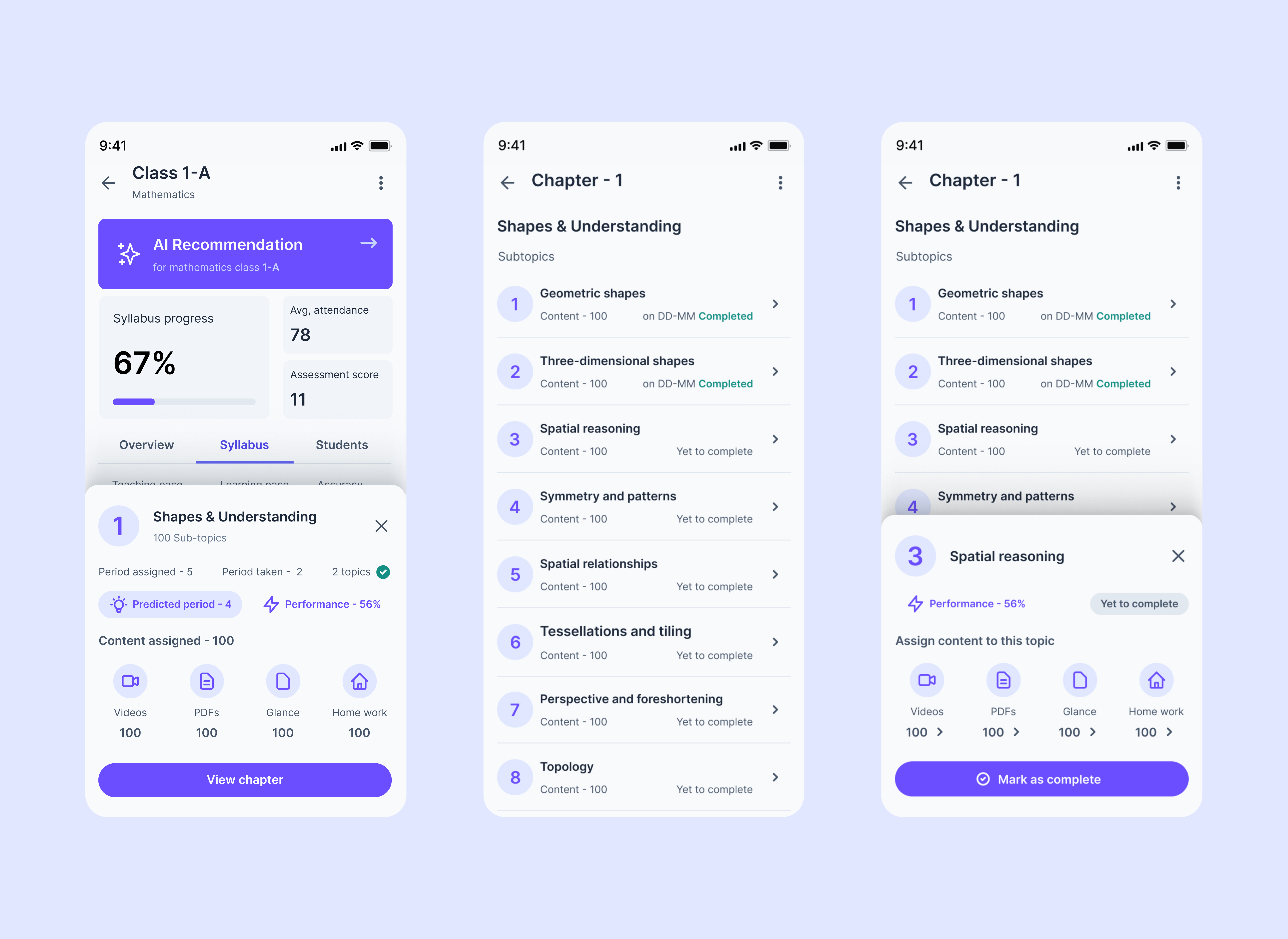
The syllabus tab enables teachers to view, edit and map content while seeing chapter-specific performance data.
A period prediction estimates how many periods may be needed to complete a chapter based on performance and knowledge-grasping capacity.
08 / Student experience
Bring academic and non-academic information together without losing clarity.
The goal was to introduce innovative features that make learning fun and easy while ensuring concepts are learned correctly.
Academic and non-academic data ultimately ends up in the student profile. I designed sections so future sections could be added.
AI recommendations received more emphasis in the profile. The class view was categorized based on information architecture to make it more accessible.
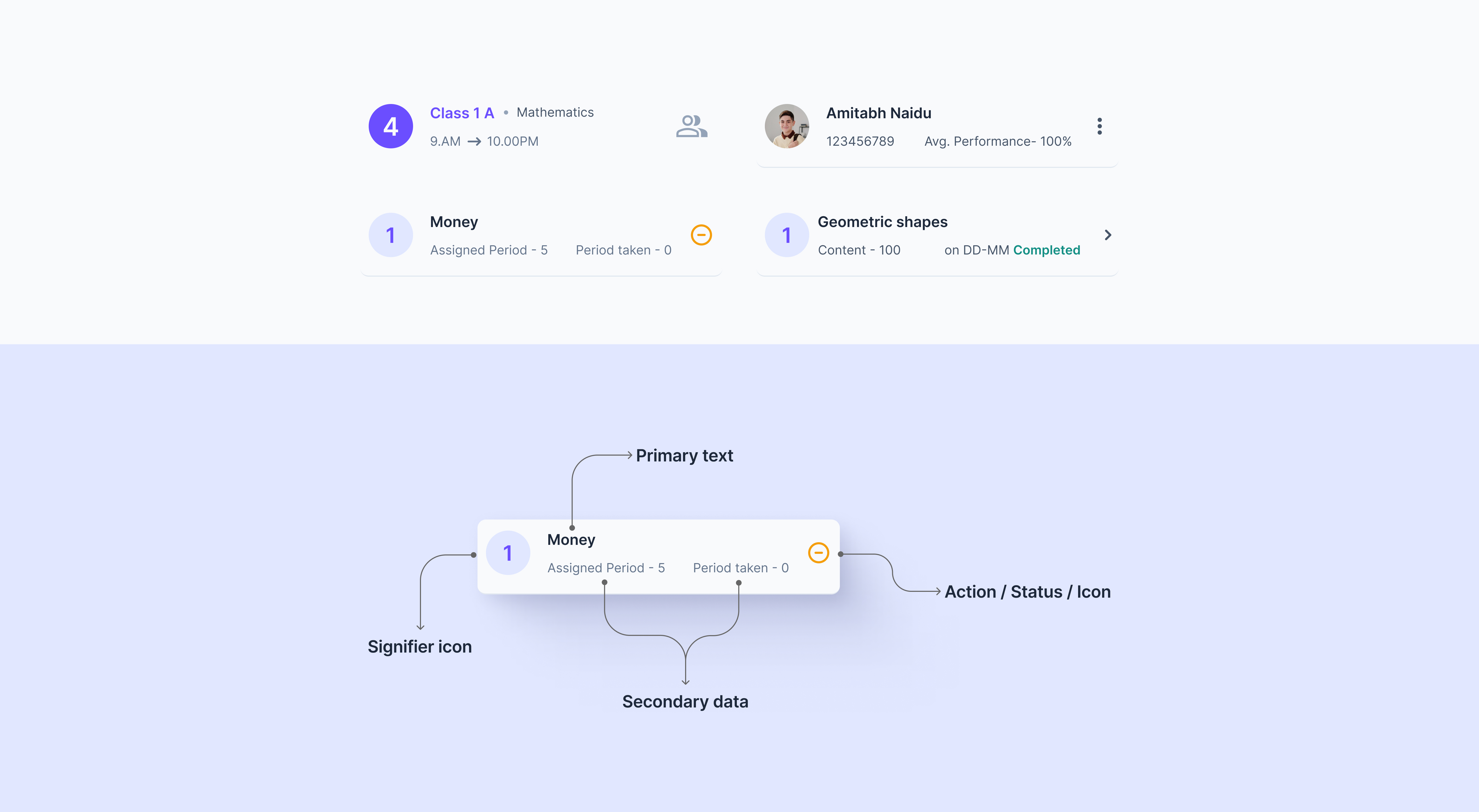
Universal card design
The universal card design decreased cognitive load, remained visually appealing, was easy to scan and emphasized important data points.
09 / Other features
Build the supporting workflows as one system.
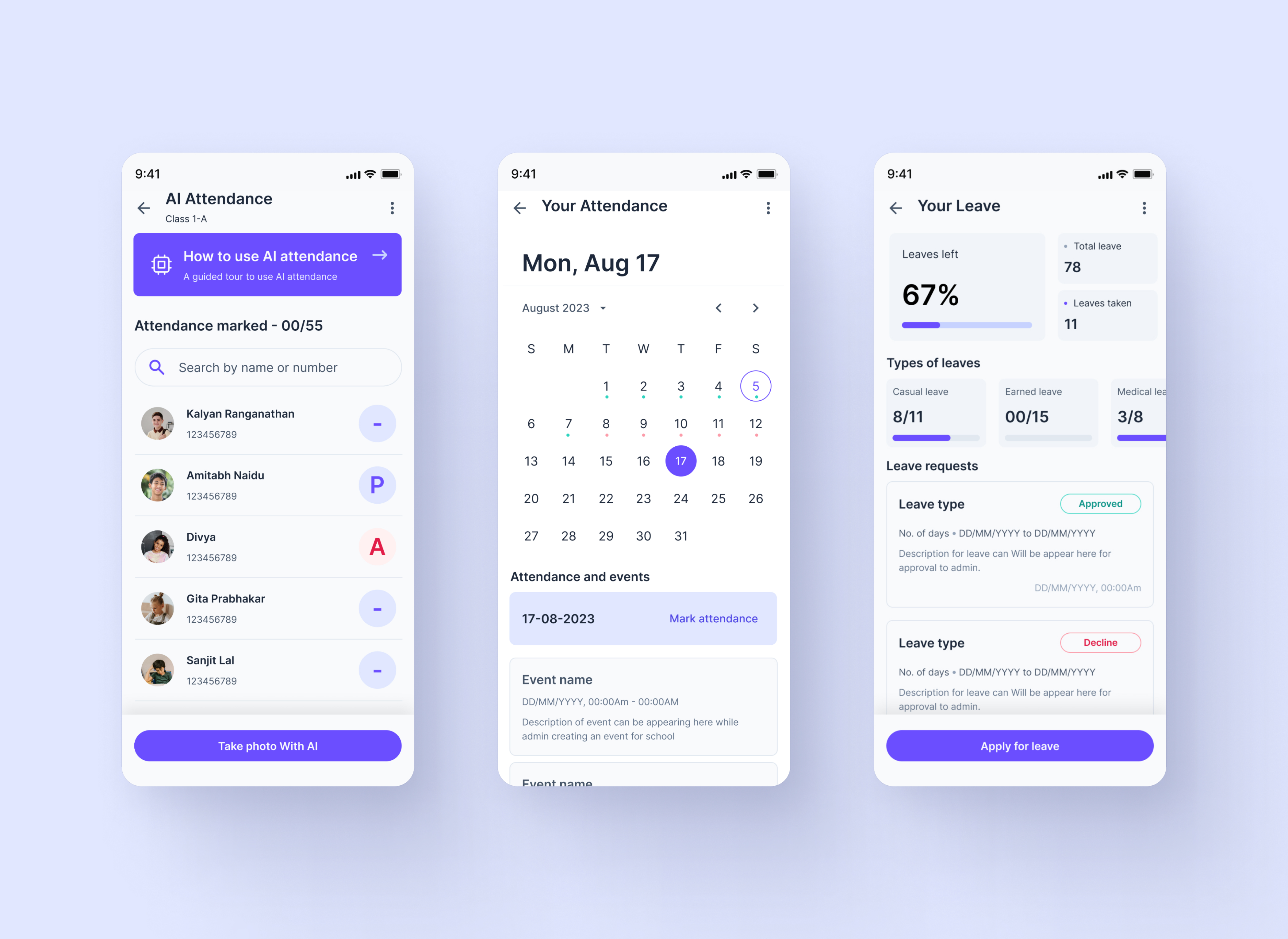
Dedicated workflow for teacher leave.
Combined attendance and events in one experience.
A structured profile for teacher information.
A clearer view of the teacher's schedule and daily context.
Designed as part of the same information architecture and product system.
10 / User testing
Validate whether the redesign actually made the product easier to use.
I interviewed teachers regarding the new AI and application functionalities. I explained how the app works and asked their opinion on the new and old versions.
Overall usability was good compared with the old experience.
Teachers found navigation easier and needed less explanation.
Functionality was easier to understand, while OCR and face recognition remained harder to understand.
The testing also helped me understand how teachers think about lesson planners and Konnect usage, while revealing upcoming feature opportunities.
11 / AI in my process
AI helped me move faster, not outsource design decisions.
I used AI to explore ideas, challenge interaction patterns, structure complex information and accelerate repetitive design work.
I remained responsible for product direction, UX decisions, design iterations and validation with teachers and the team.
✦AI was a force multiplier in the process. The product decisions, design direction and final experience remained mine.
12 / What I learned
Complex products become clearer when information, intelligence and workflow work together.
- Learned more about backend processes, percentages and data points.
- Teacher interviews revealed opportunities around lesson planners and Konnect usage.
- Discussing upcoming features helped shape the product foundation for future capabilities.
- Improved my WCAG and accessibility knowledge. The project passed WCAG 2.0 compliance.
The biggest learning was that AI features only create value when they appear at the right moment and are presented in a way teachers can understand and act on.